Overview
Context
Nigeria moves over 66 million litres of fuel a day, more than 90% of it by road tanker across long-haul routes through every state. Around 200,000 barrels are lost to theft and diversion daily, and tanker explosions have been linked to over 1,800 deaths between 2009 and 2025. So getting fuel logistics right in Nigeria is genuinely a safety and money problem, at national scale.
The client runs 400+ retail stations and thousands of trucks a day. Even at that scale, the logistics was still fragmented. Dispatch, validation, and financial settlement all acted on the same trip with nothing connecting them. I joined to help design Transporter: one ecosystem that put movement, verification, and money on the same set of facts, from depot to delivery.
The first day
I walked into a project that had lost the people who understood it, with no handover. The UX designer who had been running the project cycles and owning the flows had left the company. The other person who had worked alongside him was at the hospital with his mother and wouldn’t be back for at least a week. What was left was me and two other designers, Dhairya and Miral, working through a client call recording and taking notes to piece together where things stood.
They handed me the old system to study. It was enormous, and on day one it was honestly overwhelming, so instead of trying to swallow the whole thing I sat with the team and asked what the priorities were and how far along we actually were. That got me to the Figma file, which was a much better entry point. The customer app was the current focus, a client call had happened the day before, and the team was working through the feedback from it.
I sat in on that call review with them, and made one small process suggestion that stuck. We started logging timestamps against every piece of client feedback, not just the note itself. That way, if the founder or a senior asked later when exactly the client had asked for a change, we could point at the minute in the recording instead of arguing from memory. It’s a small thing, but it saved us arguments for the rest of the project.
The Call I Made Before Anything Else
Reading the Figma designs against the old system, one thing jumped out: the old system had the use cases, our new design didn’t have the flows.
The gap
The client’s system already handled multiple customers, multiple orders, and dry, bulk and container cargo. Broken, but the cases were there. Our redesign had those options in the interface with no flow behind them: everything built so far assumed single customer, single product, wet cargo. That flow was approved, and the plan was to keep extending from it. If it shipped, the gap would surface in deployment and land on us.
Making the case to stop
Nothing looked broken, so reopening an approved flow read as an admission. I argued cost, not correctness: order feeds scheduling, scheduling feeds trips, trips feed invoicing, and invoicing wasn’t even designed yet. Fifteen days now, or two months of downstream rework later. The founder and senior designer agreed, and the client gave us the time.
Mapping it out
The senior designer and I whiteboarded every combination of single or multiple customers and orders, across wet, dry, bulk and container, plus edge cases. The hardest: contamination on a multi-customer trip. If one load is spoiled, does the trip continue, does everyone’s delivery decline, or only theirs? One trip can mean many pickups and drops in a set sequence, each a different set of screens and rules, and none of it existed. The client had been seeing one happy path; now he was looking at his actual business.
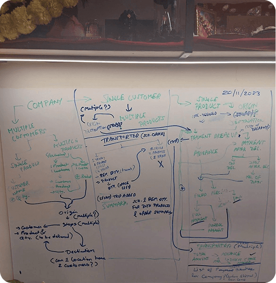
Mapping order permutations
before rebuilding the flow logic.
Tradeoff
15 days and an approved flow reopened, against a foundation that would have collapsed under the first non-standard order. Every flow built after those 15 days held up because of them, and invoicing, which hadn’t been designed yet, got built on solid ground.
The Product
Five platforms, one continuous flow. An order placed in the portal generates a trip for a driver. That trip produces a fuel voucher. An attendant scans it at the depot. The manager tracks what was dispensed. The customer tracks the delivery. One chain, end to end.
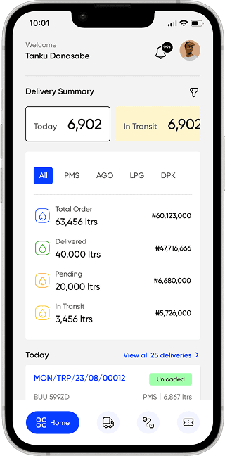
Driver App
Trips, fuel vouchers, documents, earnings, and delivery verification.
Customer App
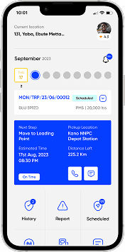
Order placement, shipment tracking, history, and payments.
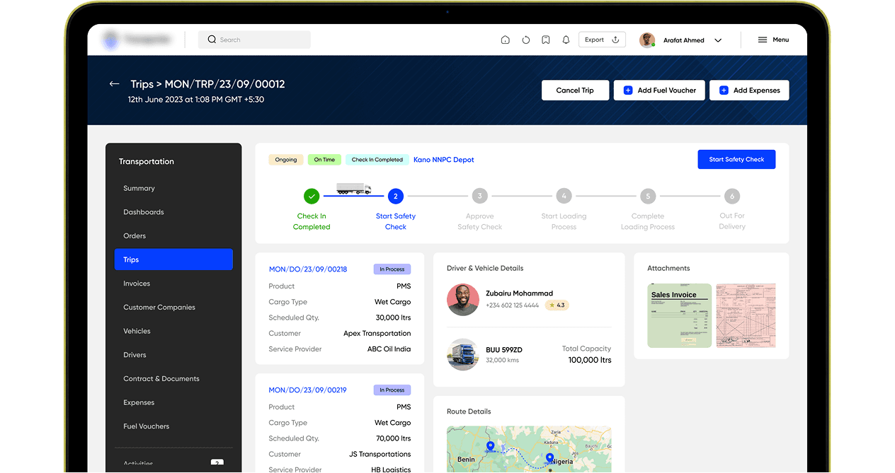
Transport Management Portal
Orders, trips, invoices, vehicle and driver management, depot and station coordination, and support for every actor in the chain.
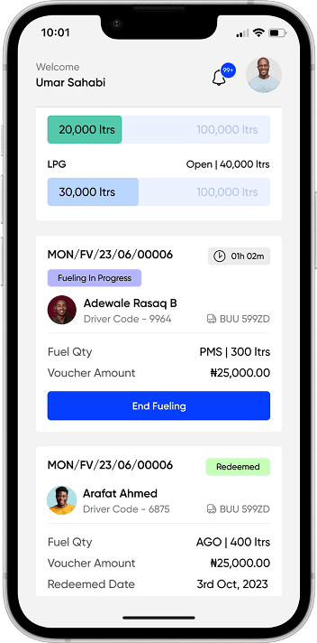
Fuel Depot Manager App
Tank inventory, attendants, vouchers, fuel requests, and restocking across depots.
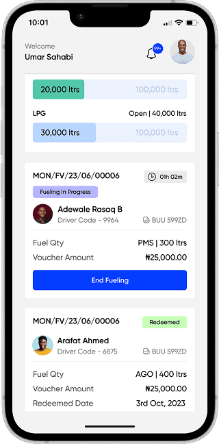
Fuel Attendant App
Voucher scanning, fueling confirmation, and driver verification at the pump.
How four people ran five platforms
We never built all five at once. Two, sometimes three, ran in parallel, and what got worked on came down to one question: what are we presenting at the next client call? Feedback from the last call had to be visibly implemented by the next one, so priority moved with the client’s attention. If he wanted more of the Fuel Depot Manager app, the team shifted there and the portal dropped down the list that week.
Roughly: the senior designer held the Transport Management Portal, which was the most complex surface by a distance. Dhairya and Miral held the Customer App. I moved between the portal and the apps, because after the order flow catch the team had decided I was the one who would spot what everyone else walked past, so I got put wherever the flows needed checking. Sequence-wise: Customer App first, then the portal, then Fuel Depot Manager and Fuel Attendant. The Driver App was mostly done before I arrived.
My standing responsibilities across all of it: design and prototype the next flows, make sure client feedback actually landed in the designs, and take an hour before every client call to click through the entire prototype myself and make sure nothing was broken. That last part is why the client never hit a dead end in a demo, and it’s the reason his feedback stayed on product decisions instead of on our polish.
Consistency across five platforms never became the problem you would expect, and the reason is pretty unglamorous: the team only ever shrank. The senior designer eventually got pulled onto other projects and we became three. Nobody new was ever added. Everyone left on it had been there since day one, so we all already knew how the design system worked and where the components lived. There was no knowledge transfer to get wrong.
Key Product Decisions
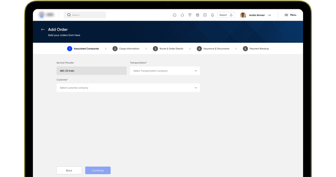
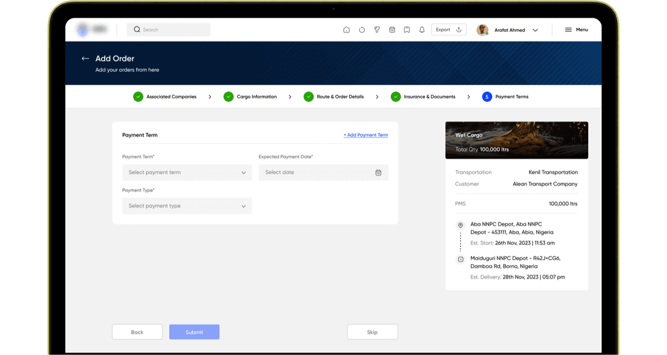
Order creation: five steps, because five things are being decided
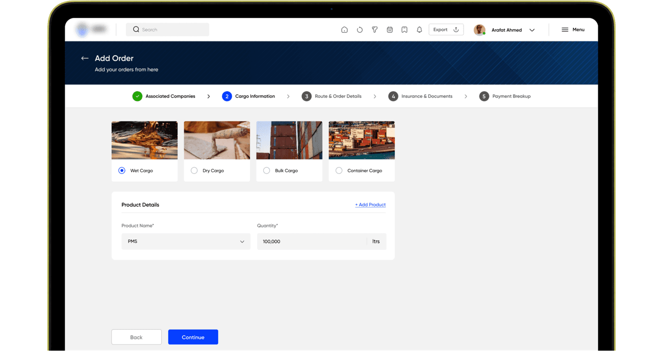
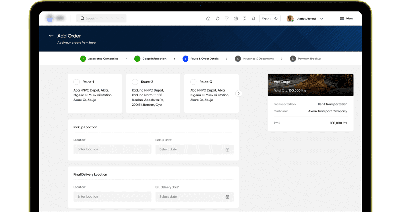
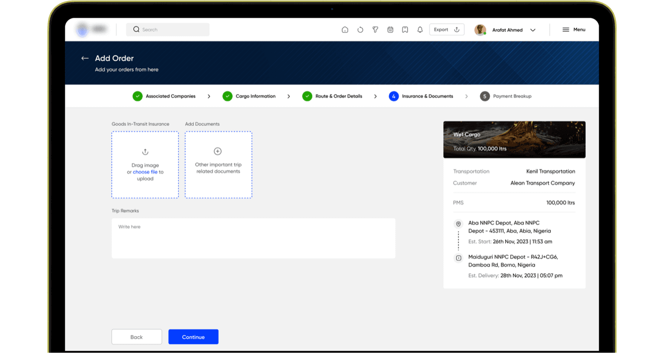
Order creation is a five-step flow, and the step count comes from the shape of the information itself:
1Associated Companies: who the customer is, who the service provider is, who the transporter is
2Cargo Information: what the product is, what cargo type it is
3Route & Order Details: pickup point, delivery point, pickup date, estimated delivery date
4Insurance & Documents: goods-in-transit insurance, trip documentation
5Payment Breakup: payment terms, which can be single or multiple depending on the customer
The rebuild made this flow longer than the original happy-path version, so keeping it navigable mattered. 6A running summary panel sits alongside every step: cargo type and quantity, the parties, the route with estimated pickup and delivery times. You always see what you’ve already committed to while you fill in what’s next, so five steps never feel like five disconnected forms.
Cargo type decides everything downstream
Cargo type is the decision the rest of the flow hangs on. Generic logistics systems treat all cargo the same; with fuel you can’t. Wet cargo needs preloading safety validation, volume-sensitive handling, and verification at the sub-tank level for compartmentalised tankers, so partial diversion or overload gets caught before the truck leaves the depot. Dry cargo needs weight verification and its own loading logic. So these run as separate workflows with their own validation built into the flow, working as an actual safety check rather than a label on the order.
Because so much hangs on that one choice, cargo selection is a large photographic card rather than a dropdown line item, hard to mis-click past. That treatment predates me, it was already in the design when I joined, but the reasoning holds.
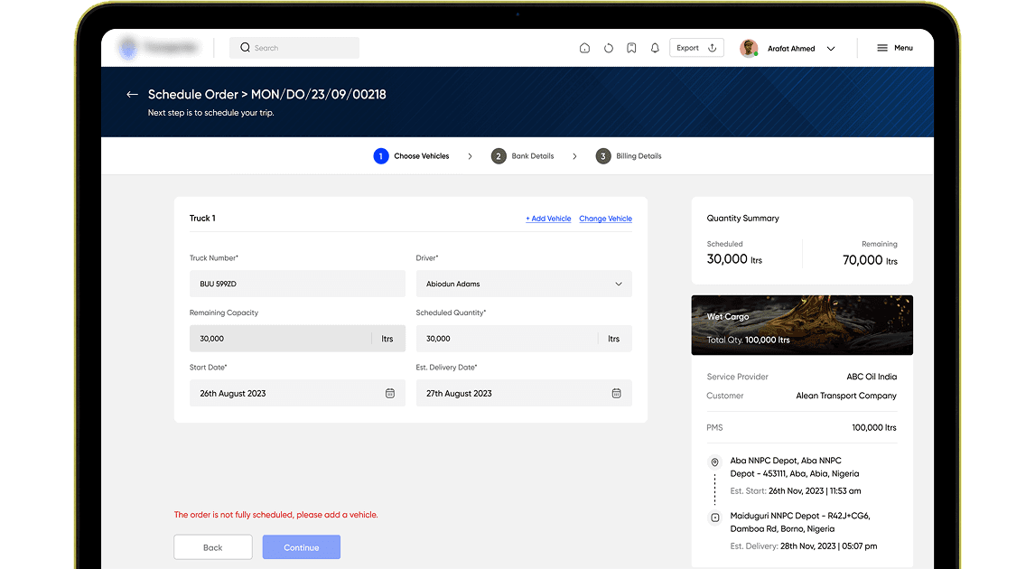
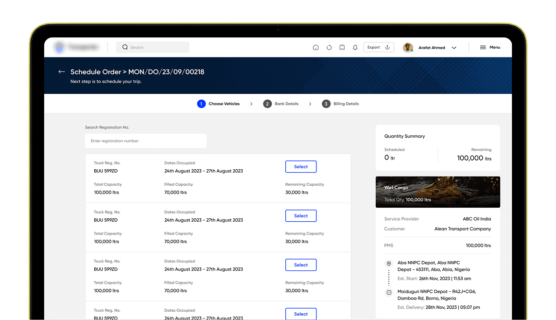
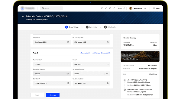
Scheduling: fill existing capacity before adding trucks
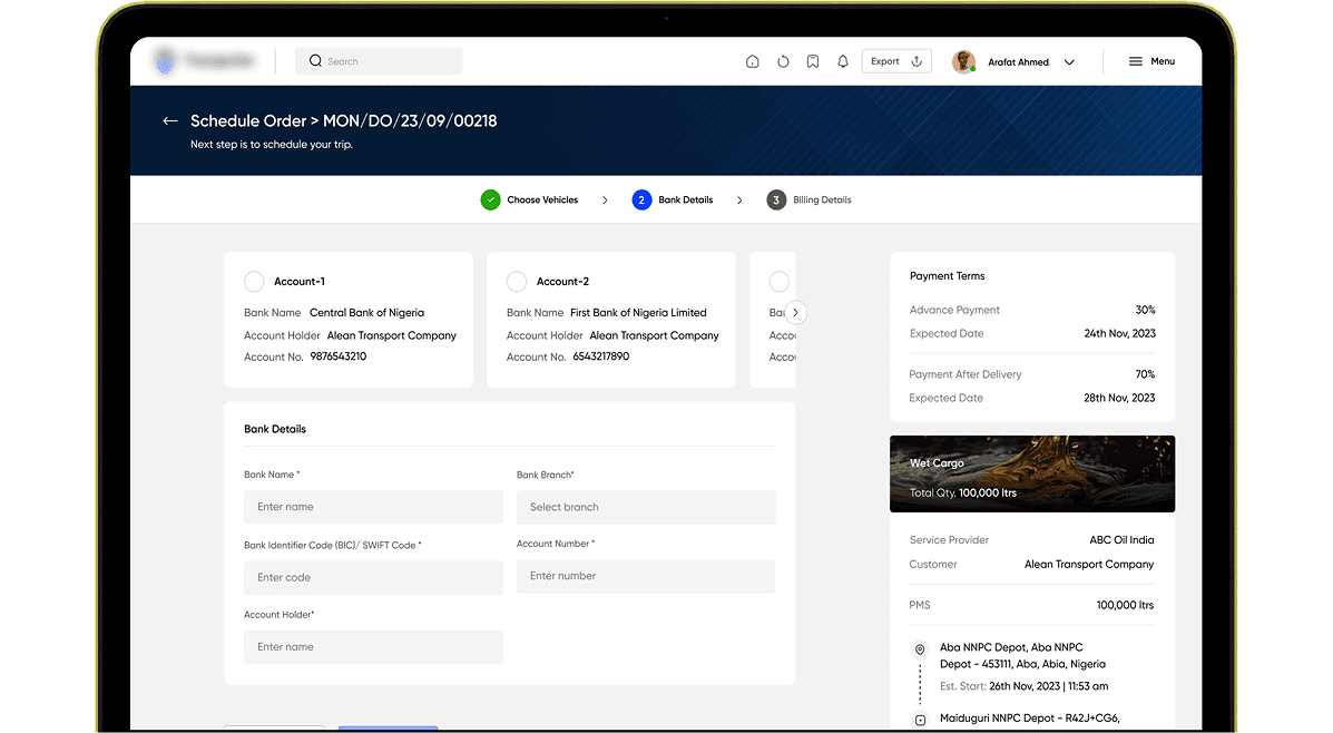
A large order rarely fits one truck. The scheduling logic prioritises filling trucks with partial capacity before assigning new vehicles, which directly improves fleet utilisation. 1The operator selects a truck, sees filled and remaining capacity, sets dates, and watches a live quantity panel track scheduled versus remaining litres until the full order is covered. 2Bank and billing details follow as separate focused steps, with the payment breakdown auto-calculated before anything is committed.
The fuel voucher system:
designed against a specific fraud
Fuel vouchers exist because the company, not the driver, pays for the fuel that moves its trucks. That creates the obvious exposure: a voucher is a company-funded claim on fuel, and it can be handed to someone it was never issued to. The scenario we designed against is concrete, a driver passing his voucher to a friend, whose truck then gets filled at the company’s expense. Every rule below closes off one way that could happen.
1Redemption is an identity check.
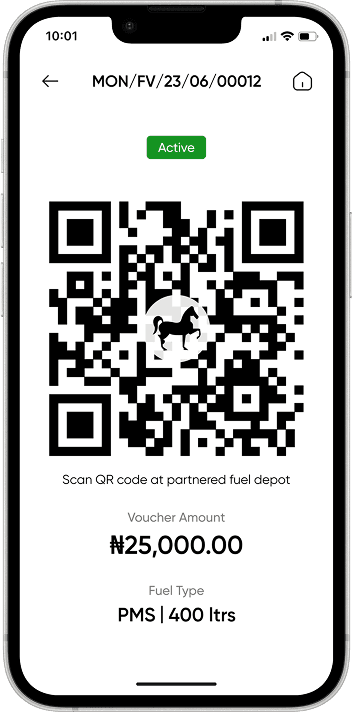
The attendant scans the QR from the driver’s app and sees the driver’s photo, name, vehicle registration, fuel type, and authorised quantity, all pulled from the trip record. He doesn’t have to ask the driver anything or trust what he’s told. He matches the face and the plate himself.
2The odometer photo unlocks redemption.
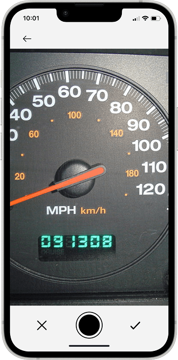
The driver isn’t paying for the fuel, so nothing inherently stops him spending it on a personal detour or a side delivery. He taps to redeem and can’t complete it without capturing the reading first, so fuelling never happens without a distance record attached to it.
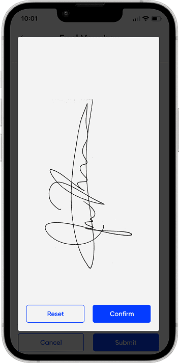
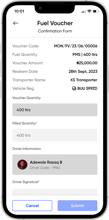
3Submission is locked until quantity and signature both exist.
When fueling ends, the attendant enters the filled quantity, the system determines full or partial redemption automatically, and the driver signs on the attendant’s device. If the amount filled doesn’t match what was authorised, the driver can raise a dispute right from the voucher screen, on the spot.
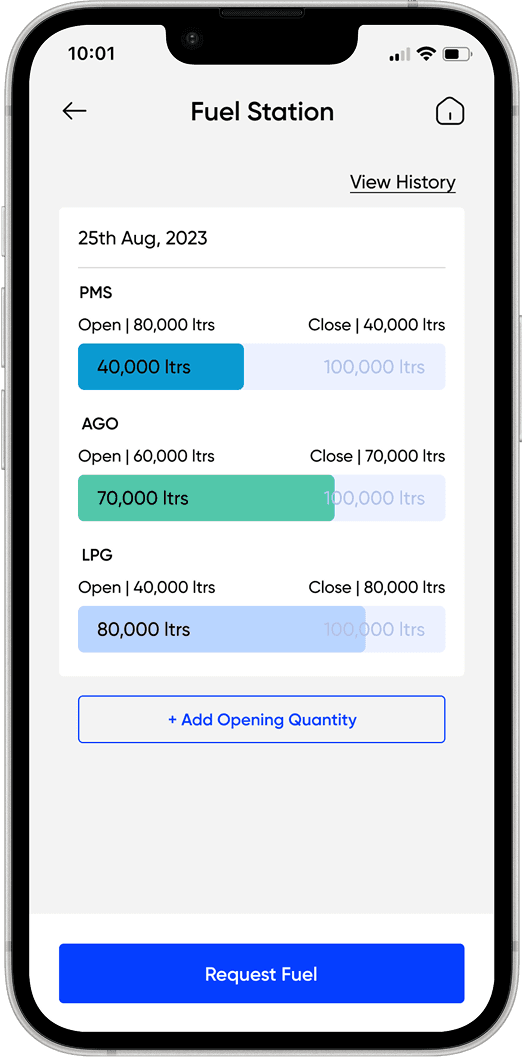
4The depot side reconciles daily.
The manager’s app tracks every tank, opening stock, distributed, and available, with two alert thresholds. Daily opening and closing stock reconciliation was designed for overnight theft detection: any mismatch becomes an immediate, documented discrepancy with an audit trail.
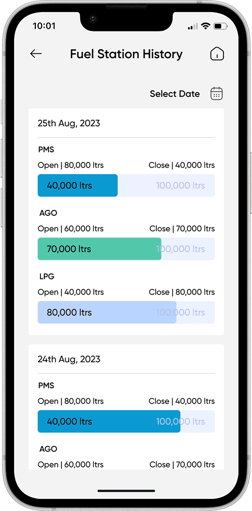
Driver App
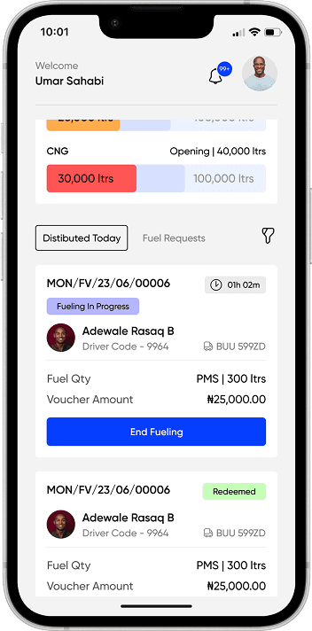
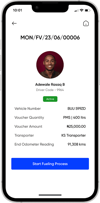
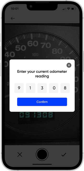
Fuel Depot Manager App
Delivery verification
The far end of the trip runs on the same principle, with the customer doing the checking. Before unloading, they scan a QR to confirm the right driver and vehicle actually turned up. They capture the closing odometer themselves, so that second reading is one the driver has no hand in at all, and the two readings bracket the trip against the route he was assigned. Both parties sign, so what was agreed on quantity doesn’t rest on either side’s memory afterwards.
Driver App
Customer App
The Driver App
Drivers operate heavy vehicles on long-haul routes, often in low-connectivity areas, often with limited experience of digital products. If a driver gets confused by the interface mid-trip, that’s a safety risk, so the target was zero navigational overhead: every critical trip state and action visible without opening anything, with touch targets sized for gloved, on-the-move hands.
A trip can carry orders from multiple customers to multiple drop points. The trip screen shows every checkpoint in sequence, each with live status, backed by GPS tracking and RFID validation at key points. And because contamination or quantity discrepancy happens routinely in fuel, it’s not some rare edge case, delivery can be accepted, partially declined, or fully declined at any checkpoint.
Support built for missing fuel
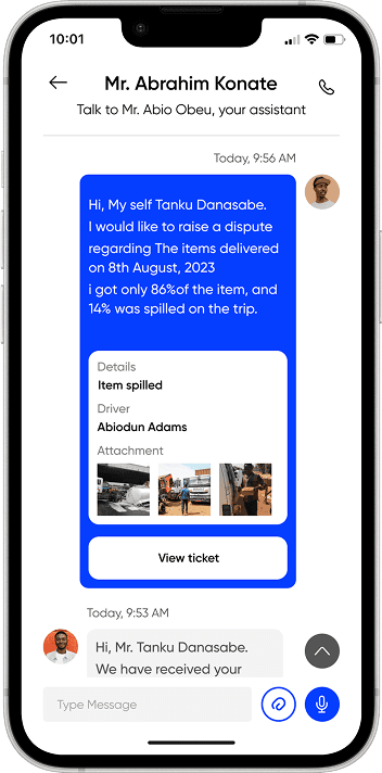
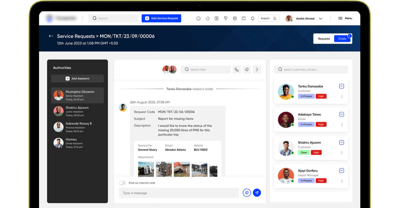
When 100,000 litres of PMS disappears between depot and delivery point, that’s a financial and safety incident, and the support system treats it like one, not like a lost parcel. Every ticket carries full operational context from the moment it’s raised: request code, driver, vehicle registration, photo evidence, all required up front instead of dragged out over follow-ups. Any actor in the ecosystem can raise one: customer, driver, depot manager. Support staff can post internal notes alongside customer-facing messages in separate threads within the same record.
Support UI(Driver/ Customer/ Fuel Depot Manager)
Support Provider UI
How we presented cross-app flows
Five apps that talk to each other are almost impossible to review one screen at a time. The client could see the Driver App, and he could see the Fuel Station Manager app, but the thing he actually needed to judge was what happens between them.
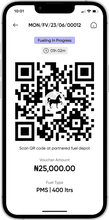
So for the fueling flow we stopped presenting apps and started presenting the exchange itself: driver’s screen on the left, Fuel station manager’s screen on the right, and every step annotated down the side. Driver taps Fuel to open his QR. Driver enters and photographs the odometer. Attendant scans. Fueling starts. Fueling ends. Attendant fills the confirmation form, takes the driver’s signature, submits. Voucher redeemed.
The client responded to this better than to anything else we showed him. Instead of having to imagine how one app’s action would show up in another, he was watching the system behave, and his feedback got sharper because of it. He was reviewing how his operation would actually run.
Driver Application
Fuel Station Manager
- 1. Driver Clicks On Fuel To Open QR Code
- 2. Driver Enters Odometer
- Take Odometer Picture
- Enter Manually And Confirm Odometer
- 3. Depot Manager Clicks On Scan
- Scan QR Code
- Starts Fueling Process
- 4. End Fueling - Once Fuel Is Given Depot Manager Clicks On End Fueling
- 5. Fueling Ended
- 6. Confirmation Form - Depot Manager Fills Confirmation Form
- Takes Driver’s Signature And Submit
- 7. Voucher Redeemed
What I couldn’t do
I never spoke to a single user of this system. No drivers, no attendants, no depot managers, no customers.
The access chain was closed: our team spoke to our founder, our founder spoke to the client’s CEO, and every requirement and every piece of feedback came down that line. So everything in the Driver App, an app for people doing physical, dangerous work in poor connectivity with limited digital experience, came from constraints, client input, and reasoning about the context. Nobody on my team ever watched a driver use it.
Given the same access I’d design it the same way, because the constraints were real and the reasoning holds up. But I’m not going to call it validated, because it wasn’t. On a system where a confused driver costs you litres and safety incidents, one day inside a depot would have been worth more than a month of client calls, and I’d push harder for that access now.
Outcome
The system went live and held as the fleet it served grew 50%, without operational breakdown.
The fleet grew from roughly 10,000 to 15,000 trucks during and after deployment. Around ₦40 billion in daily transport value runs through the system. I won’t claim the design drove the fleet growth. What I can stand behind is that the system scaled with a 50% larger fleet without breaking, and for a foundation we rebuilt under pressure in the first week, that’s the outcome I care about.
“Implementing Transporter has been a game-changer for our fleet management. It’s like having a digital co-pilot that ensures safety, efficiency, and control every step of the way.”
– CEO MRS Oil Nigeria
I left the company about two years ago, so post-launch metrics beyond fleet scale and transport value aren’t available to me directly.
Reflections
The most important decision on this project happened before I designed a single new screen, and it had nothing to do with design. It was convincing three people who outranked me that work they had already approved needed to be reopened.
That was the actual difficulty. Spotting the flaw took a few days of reading the old system against the new designs. Getting the team to accept it took much longer, because nothing appeared broken, the client hadn’t complained, and admitting a gap to a client who measured us in weekly progress felt more expensive than the gap itself. What eventually worked was dropping the argument about being right and making it about cost: this gets more expensive every week we don’t fix it.
And the thing I never let myself forget on this project: when the product is fuel moving through Nigeria, a design mistake isn’t just a usability issue. It can mean stolen fuel, financial loss, or worse. Almost every hard decision here, the voucher identity check, the odometer gate at redemption, the two-sided delivery signature, exists because someone in that chain has a reason to lie. That’s a very different problem from designing something people enjoy using, and it’s the kind of problem I’ve come to enjoy.