Overview
Context
QuickMart is a Nigerian retail and fuel chain, the convenience-store-attached-to-a-petrol-station model, operating in every state in the country. It’s run by the same company behind Transporter, and it came with the same problem: a backend portal built by developers with no designer anywhere near it. No documentation, no contact with the development team, and one touchpoint on the client side, the CEO, who I could only reach through my founder.
I’d just come off Transporter when I moved onto this, so I knew the shape of the problem going in. QuickMart was arguably worse. Transporter had broken flows; QuickMart had whole sections of data with no forms behind them, and a lot more of them.
Reading a system with no manual
The account we were given to study was a dummy, and the data in it was inconsistent everywhere. I’d open the customer list and the first record had a handful of fields. The second had more. The third had nothing. The fourth had the most of all of them. There was no “add customer” flow anywhere, which is the thing that would normally tell me what a customer record is actually made of.
So I rebuilt the fields by hand. I went down the list opening record after record and wrote every field I saw into my notebook until I had a full picture of what a complete customer looked like. The variation across records was actually useful once I understood it: a customer who’d bought something had a purchase list, one with vouchers had a voucher list, a business customer had delegates, and one with none of those showed none of it. So reading enough records was the only way to recover the fields, since the interface was the only documentation I had.
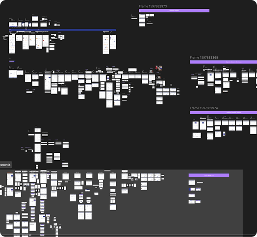
This is the part of the project people tend to underestimate. Before anyone could design a single screen, someone had to work out what the screen was even supposed to contain, and that was my job. I studied the old system and wrote down every field and every flow it implied, and then joined the team for UI and prototyping from there. When a field was genuinely ambiguous and I couldn’t reach the CEO, we’d design the flow the way we thought it should work, present it, and let the client confirm or correct. Most of the time we were close and he’d just add a field or two. That was the whole verification loop we had.
How the Monday demo shaped everything
The client had no interest in our process. No IA diagrams, no flow maps, no reasoning. He wanted to open a prototype every Monday and see more than he’d seen the week before. That one constraint decided how we worked.
So we worked one full flow at a time and got each one to a finished state before showing it. For customers, that meant building the add-customer form, then the list, then the branching between individual, corporate and business, then completing one type end to end, presenting it, taking feedback, and moving to the next type. All the structural thinking happened privately while I studied the old system. What the client saw was always a working, connected thing.
We also made the prototypes behave like real software. Every form had an empty state and a filled state, every dropdown opened, every list had working filters. If a Monday demo feels like a built product, the client’s feedback lands on how it actually behaves instead of on whatever he’s imagining. And it doubled as our own QA, because if a flow had a hole, we’d hit it while wiring up the prototype, before a developer built anything on top of the mistake.
Key Product Decisions
Three customer types, three separate systems
Individual customers buy in store or through the QuickMart e-commerce platform and collect in person, since QuickMart doesn’t deliver.
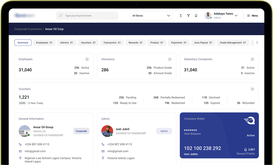
Corporate customers are companies handing fuel and product allowances to their employees by grade. Grade A might carry 4 litres of PMS per cycle, Grade B a cash allowance, and each voucher is time-bound, recycling or reissuing when it expires. The corporate flow also carries location restrictions, so a company can lock its vouchers to the QuickMart branches near its office and an employee can’t spend a company allowance somewhere personal across town.
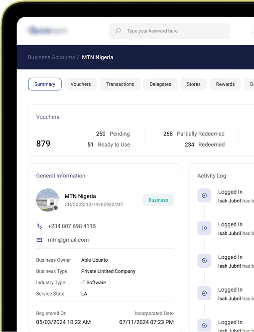
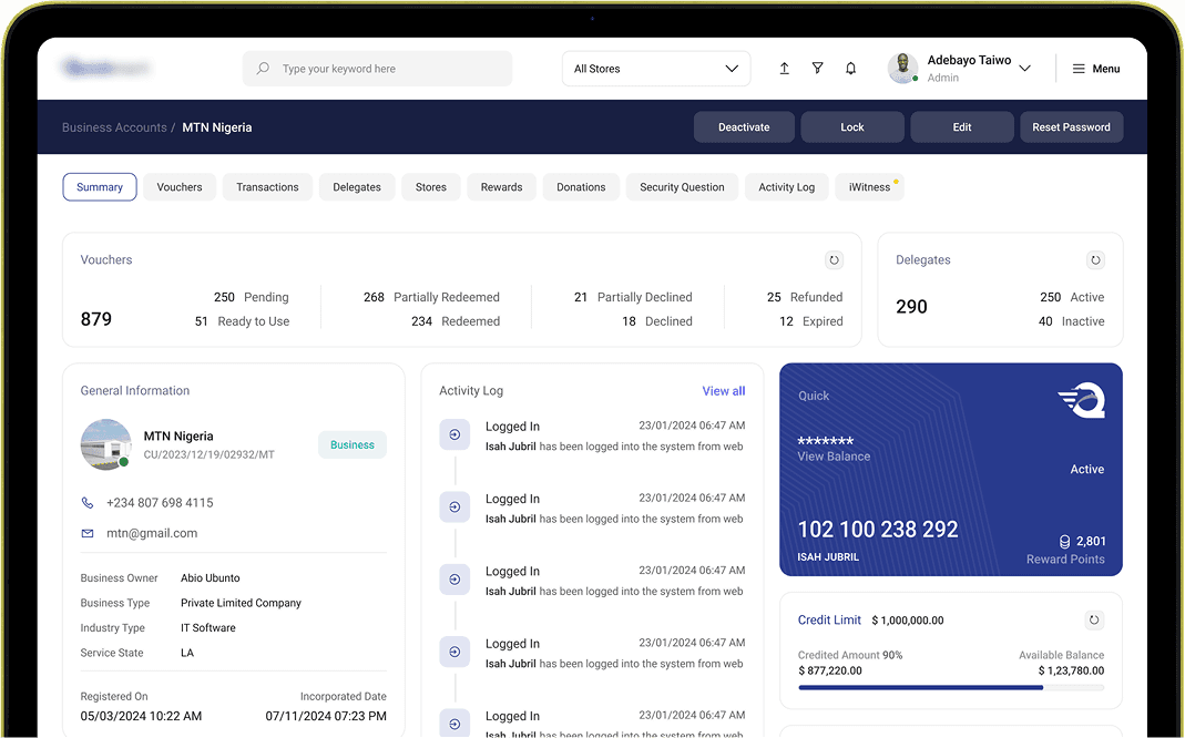
Business customers were the hardest of the three, because of delegates. A business holds a credit account, and under it sit delegates, each with their own spending threshold, their own permitted stores or regions, their own profile, and their own record of how much they’ve spent and how much is left. That’s five or six flows inside a single delegate, and a business account can have many delegates, which made it the deepest branch in the whole customer system.
So there are three pricing models, three permission models, three redemption logics sitting in one product. The danger is that they blur together on screen and a staff member acts on the wrong one, so the account type is tagged and visible everywhere, individual, corporate, business, always clear at a glance. The three flows never share a screen and never bleed into each other. The interface language stays consistent so someone moving between types isn’t relearning the product, but which type they’re looking at is never in doubt.
The voucher list that answers every question at once
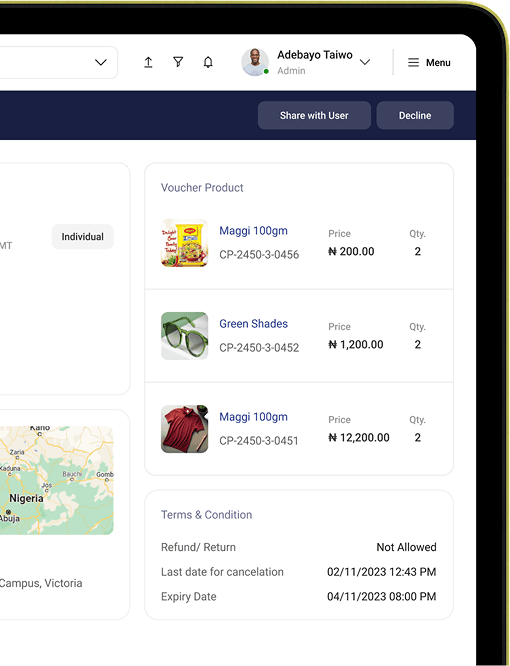
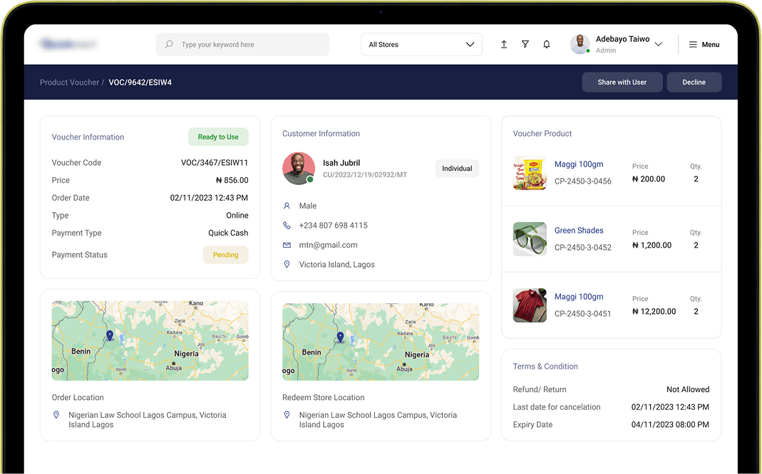
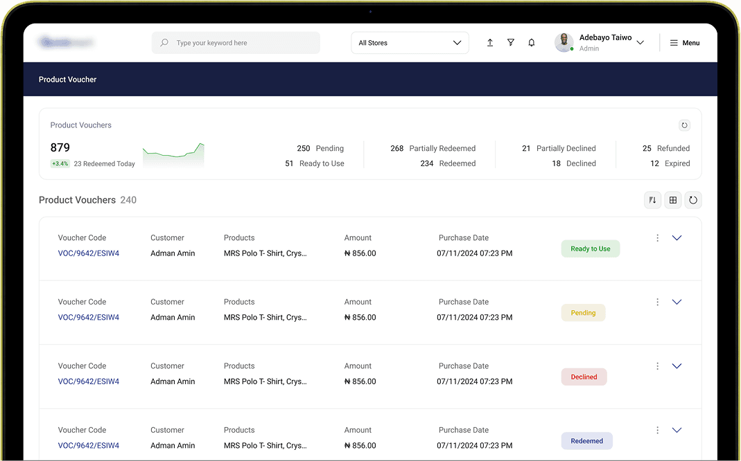
A voucher here isn’t a discount code, it’s a full transactional record, and it moves through 8 states: Pending, Ready to Use, Partially Redeemed, Redeemed, Partially Declined, Declined, Expired, Refunded. Partial redemption tracks at the line-item level, so each product carries its own Order, Redeem, and Pending quantities, and a customer can collect some items while leaving others open without voiding anything.
I recovered those 8 states the same way I recovered everything else, by reading the old system and noting every condition a voucher could end up in. Some were already in there, some weren’t, and it was clear all of them needed to exist. The design decision was in how we presented them. Instead of showing the client one state and making him picture the rest, we built the voucher list so each list item sat in a different state. In the demo we’d open them one by one, Partially Declined, Expired, Refunded, all live, so his feedback on every state was real rather than a guess about a screen he’d never seen.
Voucher transfer is worth calling out, though the idea was the client’s, not mine. Because there’s no delivery, a customer who ordered online but then couldn’t collect in person was stuck. The client raised it as a real operational problem and specified how it should work: the voucher moves to someone who can collect, with the recipient’s identity and ID captured against the record, and the order location and redemption location shown as two separate maps since in a 200-store network they’re often different places. My part was making the flow legible, so the end user always knows exactly where the voucher stands, with a notification telling the customer when the product is in store and ready for pickup.
Keeping a store from going dry
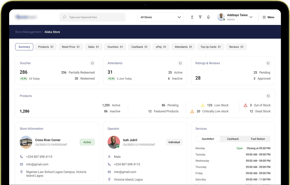
Each of the 200+ stores is its own operating unit, with a different owner, attendants, fuel types, services, and prices. The store summary screen pulls all of it into a single scroll, status, operator, top sellers, fuel types with live prices and sales volume, attendants, recent vouchers, ratings, facilities, and a map, so a manager can read a store’s health without hunting across six sections.
The stock alerting was a gap we caught ourselves. The old system had no way to stop a store quietly running out. Restocking here isn’t instant, a store reorders from a hub and the hub takes time to reach the store, so a single “out of stock” flag would fire far too late to help. We built two thresholds instead. The first is an early warning the manager can ignore if he judges the stock will last another day or two, and it’s also the point where a reorder should go in. The second is a critical alert that means refill now. Between the reorder at the first threshold and the alert at the second, the incoming stock has time to arrive, so the store never actually reaches zero. Out-of-stock is tracked as its own separate state on top of both.

One product, many SKUs, one screen to manage it
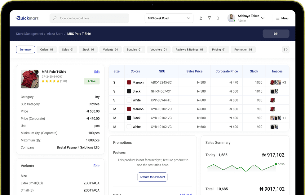
A single product in QuickMart isn’t a single thing to sell. A T-shirt is small-black, small-maroon, medium-black, each its own SKU with its own stock and its own price, and the same product can be sold on its own or inside a bundle, filed under a category, and stocked differently across 200+ stores. The old system gave no coherent place to see or manage that, so a product’s real state was scattered.
The product detail page pulls a product’s whole footprint into one view: its variants and their individual SKUs, stock, category, bundle membership, and how it’s priced. The point was that someone managing inventory should understand everything true about a product without opening five screens to assemble it, which matters a lot more when the same product behaves differently in every store.
Pricing in a country with no MRP
Nigeria has no MRP, so every store sets its own price for every product. The same brand of milk costs one thing in Lagos and another elsewhere, and it varies two ways at once, region to region and store to store, with a further layer where the same product can carry a different price per customer type. Layer that onto an inventory model where every variant is its own SKU, sold individually or in bundles across categories and 200+ stores, and price management could easily have become the ugliest corner of the system.
The move that kept it sane was designing around adjustment rather than re-entry. Prices here don’t get rewritten, they drift, a product ticks up by ₦2 or ₦3, or by a small percentage. So the super admin never retypes a price list. From a region-wise map they pick a region, a product or a whole category, and shift it by a percentage or a flat naira amount, up or down; the same works store by store. Nobody re-enters a number that’s already correct, they only move it by the amount it actually changed.
What was hard, and what I’d flag honestly
Nothing dramatic broke on QuickMart the way the order flow did on Transporter. The real difficulty was comprehension. I had to learn how a Nigerian multi-store retail operation actually works before I could design its backend, SKUs and variants, bundling, category structures, three customer segments coexisting in one store, per-customer and per-region pricing, hub-to-store restocking. None of that was knowledge I walked in with, and on a system this size, learning the business took as long as designing for it.
And the honest limit, same as Transporter: I never spoke to a user. Not a store manager, not a corporate admin, not a delegate, not a customer. The access chain was closed, my team to the founder, the founder to the client’s CEO, and every requirement and correction came down that one line. The functional rules, redemption logic, transfer mechanics, pricing structure, all came from the client. What we owned was making that machine legible and operable, for the end user and for the backend team running it. On a system this operationally heavy I’d want real user access, and I didn’t have it here.
Outcome
The system is live and operational across QuickMart’s store network. I left the company shortly after, so I don’t have post-launch metrics or usage data beyond that, and I’d rather say so than pad it. What I can point to is the scope that shipped: three separated customer systems, a 200+ store network each pricing independently, an 8-state voucher engine with line-item partial redemption, all rebuilt in 6 to 8 months from a dummy account and no documentation. Given where it started, a coherent and navigable system is the result I’m proudest of from my time at the studio.
Reflections
The skill this project actually tested was reading a system nobody could explain to me and rebuilding it from the inside. Most of my real work happened in a notebook, opening record after record of a broken dummy account until the underlying model showed itself, then turning that into flows the team could build. Having done Transporter for the same client first is a big part of why I could move quickly, I already knew what a system this broken looked like and where to start digging. At this scale the whole job is coherence: three customer types, hundreds of stores, thousands of price points and voucher states, and keeping all of it clear enough that a backend team can actually run the thing.