Overview
Context
Dayro makes premium smart switches that connect to a central node instead of traditional wiring. That one hardware decision creates enormous flexibility: any switch can control any device, one switch can control many devices, many switches can control one. On top of that sit Scenes, energy monitoring, Safety Mode, Child Mode, and ambient sensor data from the nodes: temperature, humidity, AQI.
When I joined, there was no app, no research, no documentation, and the hardware was still in active development. All of the discovery happened through client meetings, asking the right questions across sessions while the hardware team was still deciding what the switches could even do. Midway through, the spec for device connections per switch changed from limited to unlimited, and flows built on the earlier constraint had to be revisited. So for the whole project, I was designing on ground that kept shifting under me.
The decision that I made: one app or two
The original plan was a single app for both setup and daily use. Then I actually mapped the onboarding.
To set up the system, the app first has to be connected to the local Wi-Fi so the radar activates and finds the switches. Then, for every single switch, someone has to go to that switchboard, toggle it to see which device responds, register that device, and name it. When we calculated it for a typical 3BHK, that came to around 1.5 to 2 hours of technical installation work. And there was no design trick to shrink it, the length comes from how the physical product works, not from the flow.
Dayro’s customer is a premium homeowner. Their first experience of the brand could not be a two-hour chore. So in a client meeting, instead of arguing the point, I walked them through the journey switch by switch, room by room. Toggle, connect, name. Toggle, connect, name. Somewhere around the third imaginary room, the alternative became obvious to everyone at the table.
THE RESULT
A dedicated Installer App for Dayro’s installation team, and a consumer app that opens to a home already configured and ready. Two separate tools for two very different jobs. And honestly, every good decision in the consumer app came out of this one, because the app no longer had to carry a technical burden that was never its job in the first place.

The Installer App:
The screen mirrors the wall
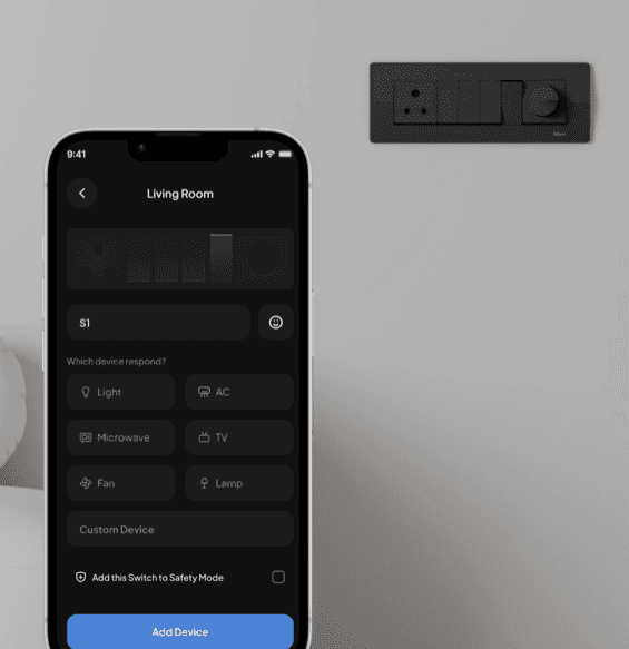
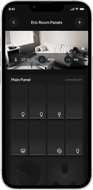
Since I’d proposed pulling installation out, designing the installer’s tool was on me too. The core decision: the panel on the installer’s screen looks exactly like the physical switchboard in front of them. If the wall has a group of four switches, a group of two, another two, and a knob (which occupies the space of two switches), that’s precisely the layout drawn on screen. The installer taps the switch position they just toggled, tells the app what responded (light, fan, AC, TV, or a custom device), names it, and moves on. No mental translation between the wall and the screen at any point, which matters when you’re doing this 50+ times per home.
Key Product Decisions
The home screen:
three versions, one argument
What the client gave us.
Their reference design put everything on one screen: every device, sensor readings, curtains, fan dials, all rendered like a physical remote. The instinct behind it was actually right, they wanted the app to feel like holding the controls. But as a screen it was organised around how the system is structured, and nobody lives their life according to their switchboard layout. Everything competing for attention at once.
How I knew habit beats hierarchy? One of my teammates had a Google Home setup at his place, and watching how he actually used it settled the question he controlled the same few switches every single day and rarely touched the rest. It matches how anyone lives. I’m not walking into the kitchen turning appliances on every morning, I’m using my own room’s switches. But the pattern is different per person: for my mom it would be her room, the kitchen, and the living room. So the design conclusion wasn’t “show fewer devices,” it was “let each person’s app reflect their own routine.” Everything pins: your rooms, your individual switches, the scenes you want on top. My app and my mom’s app would look completely different, and both would be right.
The first wireframe
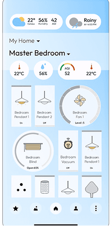
Scenes across the top for one-tap states. Directly below, a notification strip: “Upcoming Schedule: Night Mode in 30 mins” with an Off action, so an automation about to fire is never a surprise and cancelling it is one tap. Then the pinned room card, then individually pinned switches from other rooms below (my living room fan, the TV switch). Ambient data stayed off the home screen: temperature and humidity are visible on the phone anyway, so they’re available when you want them instead of permanently spending space.
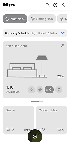
What the client’s feedback changed.
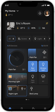
The client liked the direction, it aligned with where his head was too. His sharpest note: the room card was too small. He was right. At that size we couldn’t showcase enough switches, and the room is the thing people came for. So in the final UI the room card grew to roughly 70 to 80% of the first viewport: room name, its live temperature, humidity and AQI, device filters, and the controls themselves, with the card swipeable sideways to move between rooms and pinned switches one scroll away. The first fold now answers the question the user actually opened the app with: what’s happening in my room, and what do I want to switch.
The custom panel: drag it up, and it’s on your home screen
Pinning needed to feel effortless, because the whole home screen concept depends on people actually doing it. So we didn’t invent a mental model, we borrowed ones people already carry: the notification and widget panels on Android and iOS, and Nothing OS in particular, where you pull what you need into view and size it the way you want.
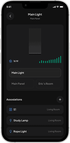
Inside a room, the screen splits at a separator. Above it sits the custom panel, everything that shows on that room’s home card. Below it, every switch the room has. 1To add a switch to your home card, you just drag it up across the separator. That’s the entire flow. No edit mode, no settings screen, no checkbox list.
The panel itself is a dynamic grid. 2A card can occupy 1×1, 2×1, or 2×2, so a control you use constantly can be dragged bigger, a full 2×2 fan dial you can actually turn, while a simple lamp toggle stays at 1×1. Nothing’s widget system on Nothing OS was the reference here, that idea of a grid where the size of a thing is itself an expression of how much it matters to you. We pulled that into a smart home context: the size of a control reflects how much you use it.
Home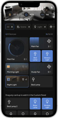 Room Inner-screen
Making digital feel physical
Dayro’s switches have a deliberate, tactile feel, and the client wanted the app to be an extension of that hardware rather than a remote control for it. The hardware itself gave us the vocabulary: the physical knob is customizable, with as many breakpoints as we choose to define, and it ships in two behaviours, a stepped one with haptic ticks at each breakpoint and a smooth one with none.
So the app’s dial mirrors the physical knob’s behaviour. A fan gets stepped control with a haptic tick at each of its levels, 0 through 6, the way the physical regulator notches between speeds. A dimmer can run smooth for a continuous glide. And because the hardware lets breakpoints be defined per device, the app exposes that: interval sensitivity is configurable, tight steps for someone who wants precision, wide or none for smooth control, with sound feedback for people who prefer audio. The app doesn’t imitate the hardware, it inherits its logic.
Scenes: Automating around conditions & time
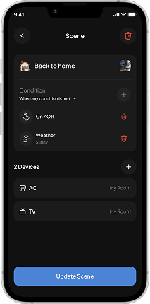
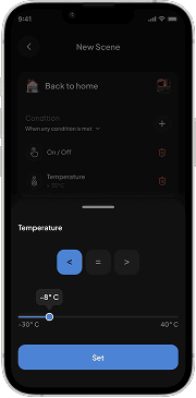
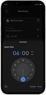
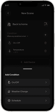
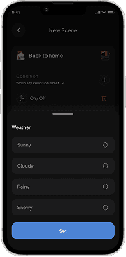
1A Scene groups devices & switches under one trigger. Night Light turns on the bedroom lamp and study lamp and warms the main light, in one tap, or automatically. The concept was the client’s, and I won’t take credit for it. What I’ll take credit for is the configuration experience. The switches’ sensors offered a lot to 2trigger on: temperature, humidity, light, time, weather, and combinations of them, plus repeatable schedules like every night except Sunday at 7PM. The risk with that much capability is a scene builder only an engineer can operate. We kept the creation flow simple enough that anyone with basic familiarity with a phone can build a scene, without hiding any of the trigger depth.
This was also the flow with the least back and forth on the project. By this point we understood the hardware well, the sensors and what they could do were already mapped, so the flow was approved essentially in the first pass.
Safety Mode and Child Mode:
sensor data as protection
The client’s brief was that a smart home needs safety and child lock features. Safety Mode was straightforward: he described it, we designed it, when temperature or electrical load crosses a user-defined threshold, every switch turns off automatically except CCTV, so security stays live while a potential overload is prevented.
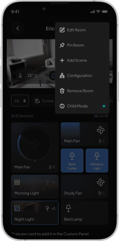
Child Mode is where we shaped the use case. The scenario we designed around: a child playing on the floor near the switchboard. With Child Mode on, the physical switches carry no current, so the child can’t operate anything from the wall, and every covered device responds only through the app. Which switches it covers is configurable, a refrigerator socket mounted high on the wall can be excluded because it’s already out of a child’s reach. The protection targets exactly what needs protecting, nothing more.
 Device settings
 Child Mode
Indication & Switch
When the hardware spec changed under us
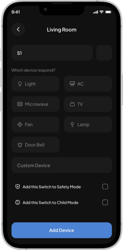
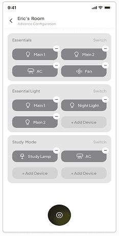
Midway through, 1the hardware team lifted the limit on device connections per switch: what had been a maximum of four became unlimited. Our switch configuration flow was built on that constraint, four placeholders per switch, and to add a fifth device you’d first have to remove one. With the limit gone, that flow made no sense. 2We rebuilt it as a dynamic list, attach as many devices as you want. In the end a contained change, but it’s the clearest example of what designing alongside in-development hardware meant: flows could be invalidated by a hardware decision made in a different room.
 Wireframe
 Final UI
Energy monitoring people can act on
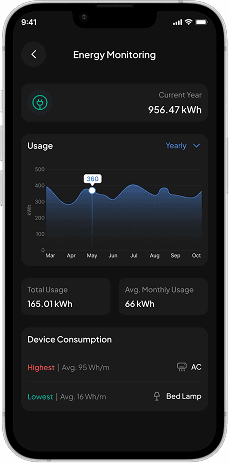
The breakdown surfaces the highest and lowest consuming devices immediately, with total and average monthly usage and comparable time filters. Knowing the AC averages 95 Wh/m while the bed lamp averages 16 Wh/m gives a user one specific place to focus, which is far more useful than staring at a graph of everything.
Three things that changed between wireframe and final, and why
1The room illustrations stayed. Each room card carries a drawn illustration of the space. Recognising a room visually is faster than reading its name, especially half-asleep, reaching for the fan.
2Scenes moved from top to bottom. In the wireframes, Scenes sat as pills at the top of the screen. It looked clean, but it was wrong: the top of a phone screen is a thumb stretch, and Scenes are among the most frequently tapped things in the app. They moved to the bottom nav where the thumb rests. The top got reserved for things you look at rather than tap: temperature, humidity, AQI, notifications.
Upcoming Schedule became a popup. Inline, it permanently spent screen real estate on information that only matters a few minutes before a scene fires. As a popup it borrows the mental model of a phone alarm: appears when relevant, offers cancel or dismiss, gets out of the way.
WireframeFinal UIOutcome
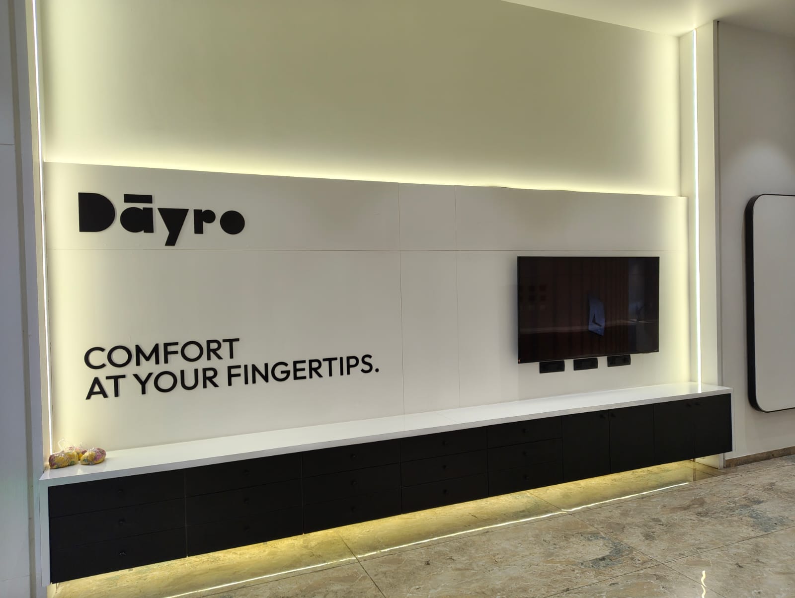
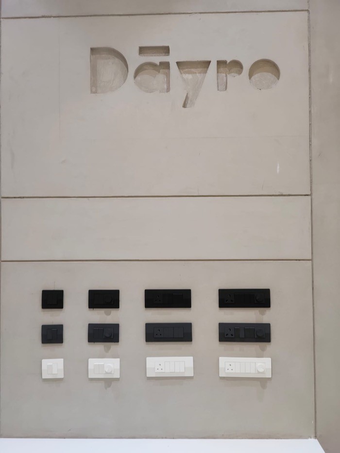
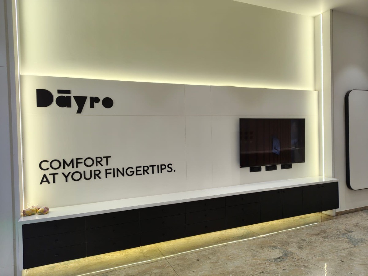
The app is live at Dayro’s Experience Center in Ahmedabad, where the full system is demonstrated to prospective buyers daily. When I checked in with the person running the demos, his feedback was that the app runs smoothly and he enjoys demoing it, and the reaction he consistently sees from visitors is telling: the switches themselves are, physically, ordinary switches. What people respond to is the app experience. For a hardware company, the software has effectively become the differentiator that sells the product.
Four residential and commercial projects have purchased the system and are currently under construction, with installations to follow once the buildings are ready. Real in-home usage feedback is the thing I’m waiting on, and I plan to go back for it once the first installations are live.
Reflections
The most consequential decision on this project had nothing to do with screens. Onboarding looked like a UI problem, but it was really a product problem, and once I saw that, the fix was structural: pull installation out of the consumer app entirely. That’s what freed the app to do one thing well. It’s something I keep coming back to: sometimes the best UI decision available is to remove an entire job from the UI.